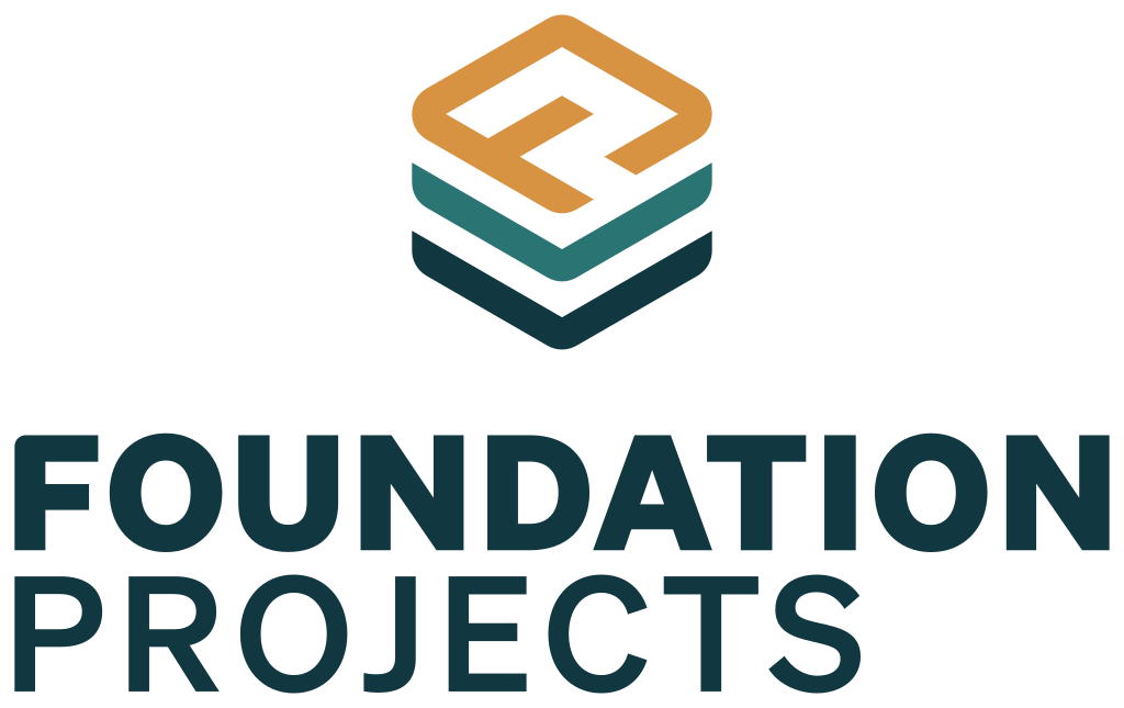
Horizontal Lockup · Primary
The primary mark. Use this everywhere unless horizontal space forces stacked. The full-color treatment is the default — black and white versions only for monochrome contexts.
A reference for designing assets that match the Foundation Projects website — colors, typography, logo usage, and visual effects for the brand kit, the freebie download, and everything that comes next. The PDF is for humans; DESIGN.md is the agent-readable format (Google open spec) for pointing any coding agent at our visual system.
Foundation Projects is built for roofing operators who deserve more than a brokered exit. The visual language should reflect that — grounded, considered, and warm.
Deep teals and anchor blues, never neon. Authority without aggression.
Serif headlines, generous whitespace, real typographic hierarchy.
Sand and cream surfaces instead of pure white. Gold accents instead of flat yellow. Subtle shadows, soft glass — never corporate-stock.
Five color families. Each one carries a meaning — use them with intent, not decoration.
Primary Gradient · CTAs & Buttons
The signature brand gradient. Teal → Green at 135°.
linear-gradient(135deg, #297373 0%, #3E8C59 100%)Warm Gradient · Badges & Highlights
For value highlights, warm callouts, hover states.
linear-gradient(135deg, #D79344 0%, #E5AD6B 100%)Dark CTA · Cinematic Sections
For inverse CTAs and cinematic dark blocks.
linear-gradient(135deg, #002128 0%, #103740 100%)Two typefaces. A serif for the editorial weight of the brand, a sans for clarity in everything else.
Newsreader
Headlines · Display · Editorial
400 · 500 · 600 (normal + italic)
fonts.google.com/specimen/Newsreader ↗Display / H1
Built by roofers.
H2
A platform for the operators who built it.
H3
What happens when you join the platform.
H4
Three operators have signed LOIs.
Body Large
Operators who join Foundation Projects don't just get a better exit strategy — they get a better business first.
Body
That's the design. We come in, help tighten the operations, build the systems, and deploy the AI tools that make a roofing company worth significantly more before it ever goes to market.
Overline / Eyebrow
Verified Operator Voice
Foundation Projects uses generous spacing — let things breathe. The site follows a fluid spacing scale that adapts between mobile and desktop.
xs
4 → 6px
Tightest gaps
sm
8 → 12px
Inline spacing
md
14 → 20px
Card padding
lg
20 → 32px
Component spacing
xl
28 → 48px
Block spacing
2xl
40 → 72px
Major spacing
3xl
56 → 96px
Sub-section breaks
section gap
64 → 128px
Between major sections
Container max
1400px
1600px on ultrawide
Container padding
16 → 48px
Responsive horizontal pad
Header height
72px
89px on mobile
Soft, modern, restrained. All shadows are built from Anchor 900 at low opacity — never from black.
xs
2px
Tags, micro pills
sm
4px
Inputs
md
8px
Cards, badges
lg
12px
Larger cards
xl
16px
Feature cards
2xl
24px
Hero containers
Button ★
10px
All buttons (intentional design choice)
Full
9999px
Pills, avatars
Shadows (rgba from Anchor 900, never black)
sm: 0 1px 2px 0 rgba(16, 55, 64, 0.04)

md: 0 4px 6px -1px rgba(16, 55, 64, 0.07),
    0 2px 4px -1px rgba(16, 55, 64, 0.04)

lg: 0 10px 15px -3px rgba(16, 55, 64, 0.07),
    0 4px 6px -2px rgba(16, 55, 64, 0.03)

xl: 0 20px 25px -5px rgba(16, 55, 64, 0.07),
0 10px 10px -5px rgba(16, 55, 64, 0.03)The website uses warm-cream glass effects (not cool blue) — important for matching the brand feel.
Glass tokens
Glass blur:        blur(32px)
Glass saturation:  saturate(180%)

Glass background:  rgba(242, 237, 228, 0.45)   /* base */
                   rgba(242, 237, 228, 0.65)   /* cards */
                   rgba(242, 237, 228, 0.72)   /* sticky elements */

Glass border:      1px solid rgba(242, 237, 228, 0.35)

/* Subtle teal glow for accent moments */
0 0 15px rgba(41, 115, 115, 0.20),
0 0 30px rgba(41, 115, 115, 0.10)For any animated assets, GIFs, or videos — match these timings so motion feels coherent across surfaces.
instant
100ms
Micro interactions
fast
200ms
Hover states
base
300ms
Default transitions
slow
500ms
Modal opens
slower
800ms
Hero intros
Easing curves
ease-out (default, smooth):  cubic-bezier(0.16, 1, 0.3, 1)
ease in-out:                 cubic-bezier(0.4, 0, 0.2, 1)
spring (playful):            cubic-bezier(0.34, 1.56, 0.64, 1)

/* Always respect prefers-reduced-motion — set durations to 0 */Four lockups, three color treatments, one rulebook. Reach for the horizontal lockup first — it’s the primary mark and what people will see most. Use stacked only when horizontal space is tight, the mark when the wordmark would be redundant (favicons, social avatars, watermarks), and the wordmark when you need pure typographic identity.
Horizontal Lockup · Primary
The primary mark. Use this everywhere unless horizontal space forces stacked. The full-color treatment is the default — black and white versions only for monochrome contexts.
Stacked Lockup
Mark above wordmark. Use when horizontal space is tight (narrow columns, square placements, vertical hero panels). Programmatically composed — designer refresh pending for hand-tuned kerning.


Mark · Icon Only
The stacked-band icon by itself — for favicons, social avatars, app icons, watermarks, and any square placement where the wordmark would be unreadable.
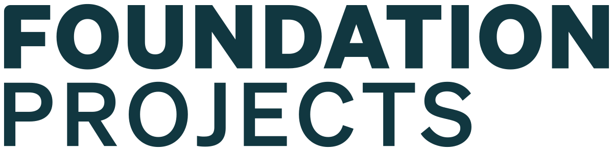
Wordmark · Text Only
The “FOUNDATION / PROJECTS” lettering with no icon. Use sparingly — when the mark is already shown elsewhere on the page, or in contexts where the icon would feel redundant.
Clear space
Leave at least 1× the mark’s height of empty space on every side of the logo. Nothing — type, photos, page edges, UI chrome — should enter that zone.
Minimum size
Horizontal lockup: 120px wide on screen, 1in wide in print. Stacked: 80px wide / 0.75in. Mark alone: 24px / 0.25in. Below those sizes the bands and letterforms break down.
Color treatments
Full color on Sand 100 (the brand cream) or any photographic background that gives the navy text adequate contrast. Use the white treatment on Anchor 900 (or any dark / busy photo). Black is reserved for single-color print, faxable docs, and embroidery / engraving.
Backgrounds
Prefer Sand 100, Sand 50, white print stock, or solid Anchor 900. Avoid placing the colored logo on teal or gold — the mark’s own bands fight the field. Avoid busy photo backgrounds unless you’re using the white treatment.
Don’t stretch
Never scale the logo non-proportionally. Always hold Shift / lock the aspect ratio when resizing.
Don’t recolor
The mark’s gold + teal + navy are locked. Don’t swap them for client colors, palette experiments, or accent moments.
Don’t rotate
The lockup is always horizontal-baseline. No tilts, no angles, no “dynamic” motion versions without sign-off.
Don’t add effects
No drop shadows, glows, bevels, or strokes. The logo carries its own depth — anything else cheapens it.
Don’t crowd it
Respect the 1× clear-space rule. No taglines, badges, or sibling logos pressed up against the lockup.
Don’t place on clashing fields
Avoid teal, gold, or busy photographic backgrounds for the colored lockup. Use the white treatment on Anchor 900 instead.
Full Logo Kit (ZIP)
Every official and derived lockup × every color treatment × SVG + PNG + PDF + favicon set, plus the Adobe Illustrator and EPS source files from the official logo package.
Download Logo Kit →ZIP · ≈3.4 MB
PDF — print-friendly, self-contained, fully embedded. Share with anyone designing assets for Foundation Projects. DESIGN.md — Google's open spec for machine-readable design systems. Point any coding agent at the URL and it will produce on-brand UI without further prompting.


